


Companies with apps usually make user interface changes from time to time either to add a new feature or to make the app look better than before. Instagram is not an exception where they started off as an iOS app only and when they ported over to Android and Windows Phone, they still had iOS elements. This is why they had a major change where Instagram was given a “flatter” look so as to even out the user experience across the various platforms.
However, it seems the company is testing another UI change on the app as Mashable reports where the app is in black and white.
It seems kinda odd why the company would want to have a black and white version of the app but a spokesperson cleared the air on the matter:
We often test new experiences with a small percentage of the global community. This is a design test only.
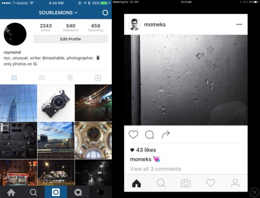
The monochrome user interface aside, there is also a major change that is reflected on the test update. The bottom bar houses the icons that enable you to jump from the Explore button, your likes and even your profile. In the new update, they have been updated where the home button has its eves shaved off, the search icon has thinner bezels, the camera button looks more of a camera, the likes button loses the chat overlay and the profile icon has a round head rather than the previous oblong head.
In my opinion, the black and white effect might not be a future update since it will distort the user interface but the icons could be released in the near future. We will have to wait and see what Instagram will roll-out in the future.


