Google announced the Material Design in Android Lollipop in 2014 which was a departure from the Holo theme introduced on Ice Cream Sandwich. Two years down the line, not all apps have been upgraded to the new design guidelines even popular apps like Twitter for Android.
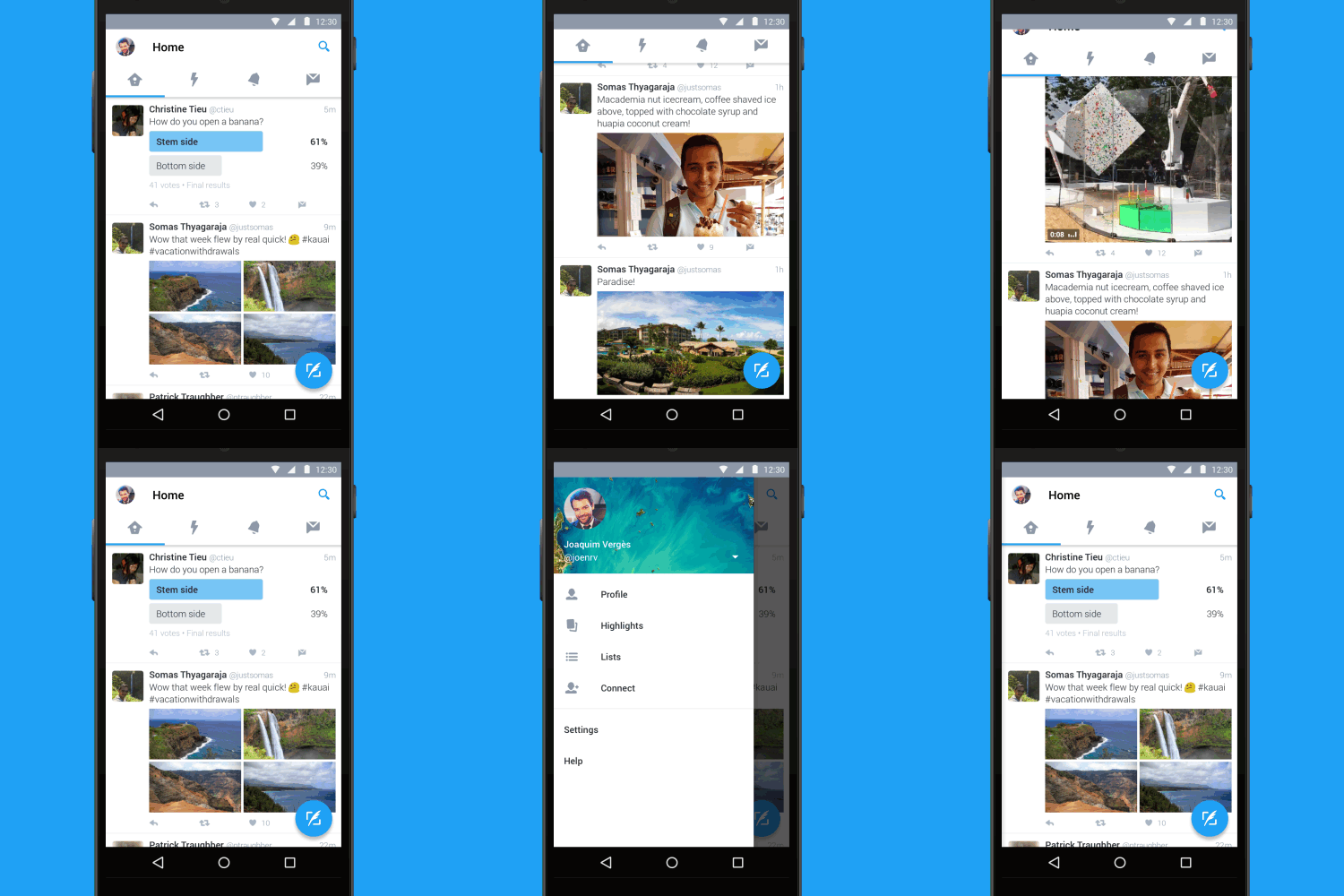
Well now that is all in the past as Twitter has announced that Twitter for Android will now have the Material design makeover. It has the ubiquitous design employed by the Material design guidelines which include the navigation menu accessed by swiping from the left and the “flatter” design of the taskbar icons.

As you can see from the above gif, when you make a “swipe right” gesture from the left, you will access the menu which has the profile, highlights,lists and connect settings. This is a departure from the current system where these are accessed by tapping on a menu button which resides on the top right of the app. The Tab bar icons are also now flatter and include the welcome change of accessing them by swiping back and forth. The search icon was removed from the tab now and now resides on the far right of the app and there is now a floating “compose” icon at the bottom right that will let you tweet faster than before.
Some of these changes were highlighted on a test to a limited number of people like the floating compose icon and the navigation bar but we are yet to see the night theme. The new update will be rolling out to everyone today globally and it would be interesting to see the comments people will make about it.


