


Twitter has been testing new layouts for their desktop site(Twitter.com) both internally and externally over the past few months since they began in January. They had notified users but people were not expecting that much. The recent design the company is testing has left people conflicted.
It has gotten some love from some
https://twitter.com/wauterboi/status/1143757478418452481
while the majority not so much.
new web twitter is the most god awful redesign.
— shaunheiser.bsky.social (@shaunheiser) June 26, 2019
Twitter did…this.
This is one of the most uncomfortable, unbalanced, wasteful site layouts I have ever seen. I liked the redesign everyone had for months. How the hell do you go from that, to the smoldering trashheap of dead space that is THIS? pic.twitter.com/iICxpl5fs5— Nehanderthal (@OnTheOtherHan) June 25, 2019
The rollout is available to most users as the microblogging platform tries to find ways to increase engagement for its current users and make it easy for new users to get on board.
This twitter redesign though???? #twitter #twitterredesign Not sure how I feel about it pic.twitter.com/hNSwXpA1Ld
— Alex(is officially in their Red Era)🌹 (@amorganic103) June 25, 2019
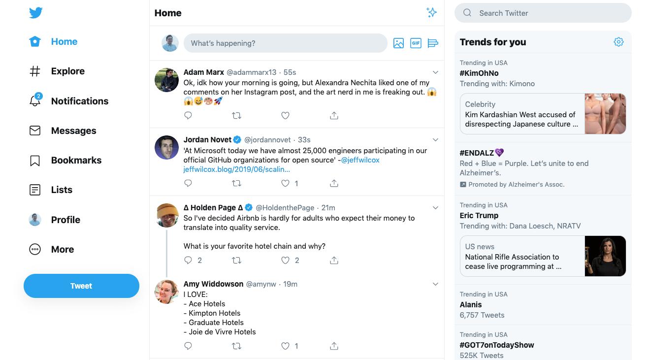
How the layout looks like
The new design has three columns, with trending in the right column, your timeline at the centre and on the left column is the Home, Explore, Notifications, Messages, Bookmarks, Lists, Profile and More. The Menu bar has been moved from the top left with the addition of a floating Tweet button plus Search will now be always available.
There is a lot to hate about the new layout
Ugh, I need eyebleach for the latest twitter redesign. 😤
— Edward Thomson (@ethomson) June 25, 2019
It’s a terrible version of its mobile website
What just happened to Twitter's design!
Their latest redesign (released publically last month) made it look like a mobile site. Now it looks like a terribly designed mobile site. pic.twitter.com/rt2kn6oarq
— Aaqib Raza Khan ⚡ (@aaqibrk) June 26, 2019
Twitter needs to work on its Progressive Web App(PWA)
Sucks. Hated it 3 months ago when they tried it. Hate it now. It is a PWA and they were too lazy or cheap to make a proper desktop experience, so they are forcing a mobile one.
— Kristine (@schachin on Threads) 🇺🇦 (@schachin) June 26, 2019
As a person who prefers small icons and fonts, I’m glad the design hasn’t been made available to me
The new #TwitterRedesign is a little jarring. The font size on the left is huge. What is surprising is there is no way collapse to just icons like in #TweetDeck.
— Matt Sandy (@appupio) June 26, 2019
this desktop twitter redesign is so bad, if only because the navigation is way too big and bold.
— george (@gtinari) June 25, 2019
Everything is all over the place
This gigantic sidebar is abysmal #Twitter #TwitterRedesign pic.twitter.com/PuDkcy4Z87
— Dustin (@DMAdust) June 25, 2019
https://twitter.com/evanlws/status/1143895516910116864
https://twitter.com/bryanhansel/status/1144002488753745921
People hate the design so much they would redo it for free
https://twitter.com/Mustafalllica/status/1143640413556883456
Here’s how to opt out
Thank the heavens, Twitter gave us an opt-out option. Click on the More button that sends you to other options including Moments, Promote Mode, Twitter Ads, Media Studio, Settings and Privacy, Help Center, Dark Mode toggle and the Switch to Legacy Twitter. Clicking on it reverts you to the old layout.
Refined Twitter is a handy Chrome extension for Twitter you should try out – thank us later.
New tweets will be added automatically without the annoying " Four New Tweets" Promoted tweets are removed too. Also when you post an Instagram link,it actually embeds the picture in the tweet. 2/ pic.twitter.com/dZzrrnVL4k
— Techweez (@techweez) February 26, 2018


