Material Design is the name for the primary design guidelines published by Google in 2014 that developers are supposed to follow while designing applications for use on the company’s Android platform. It has resulted in many beautiful applications making their way to the Google Play Store. That flat design and colourful bars that has since inspired many things beyond Android applications is now also on the way to Chrome, Google’s web browser.
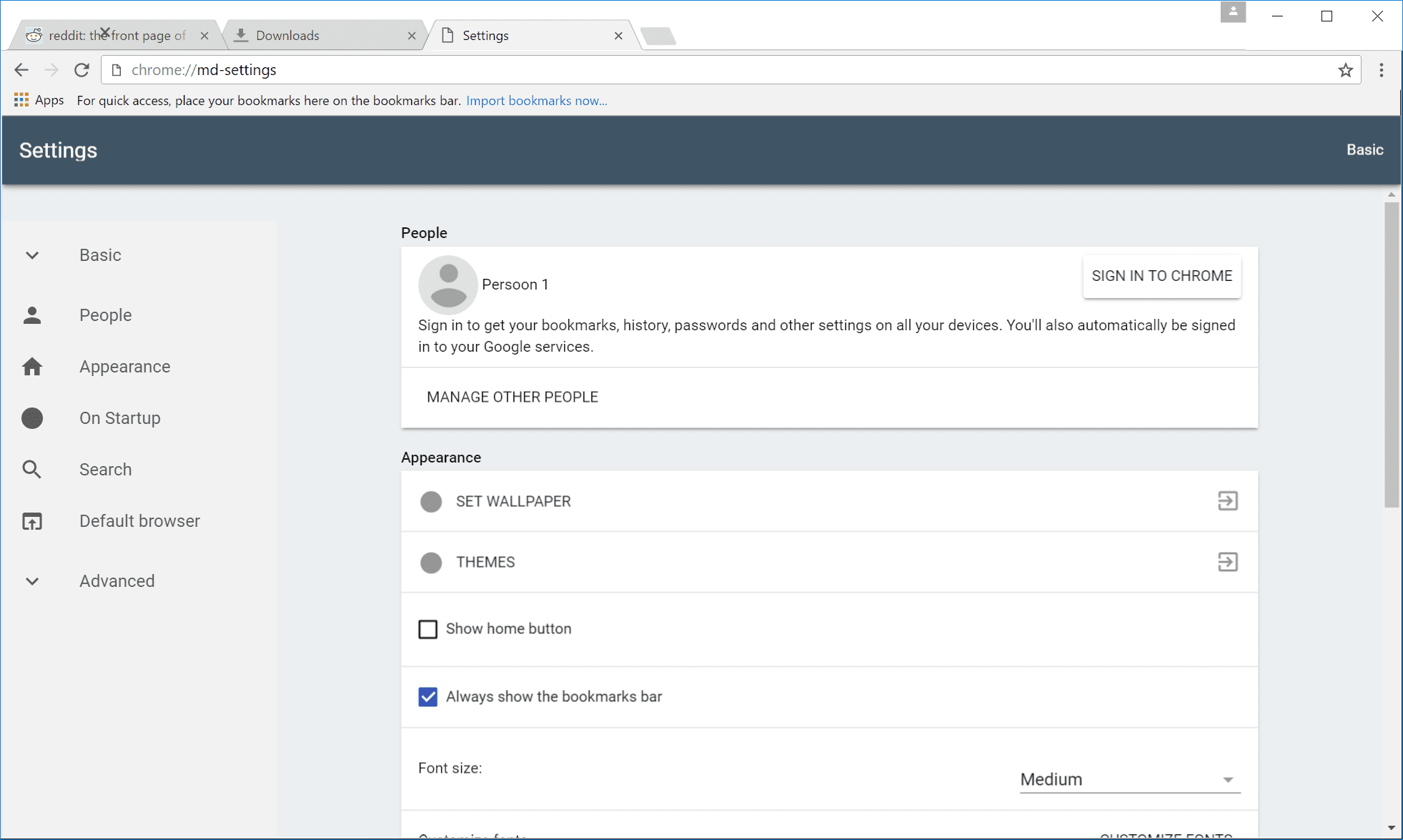
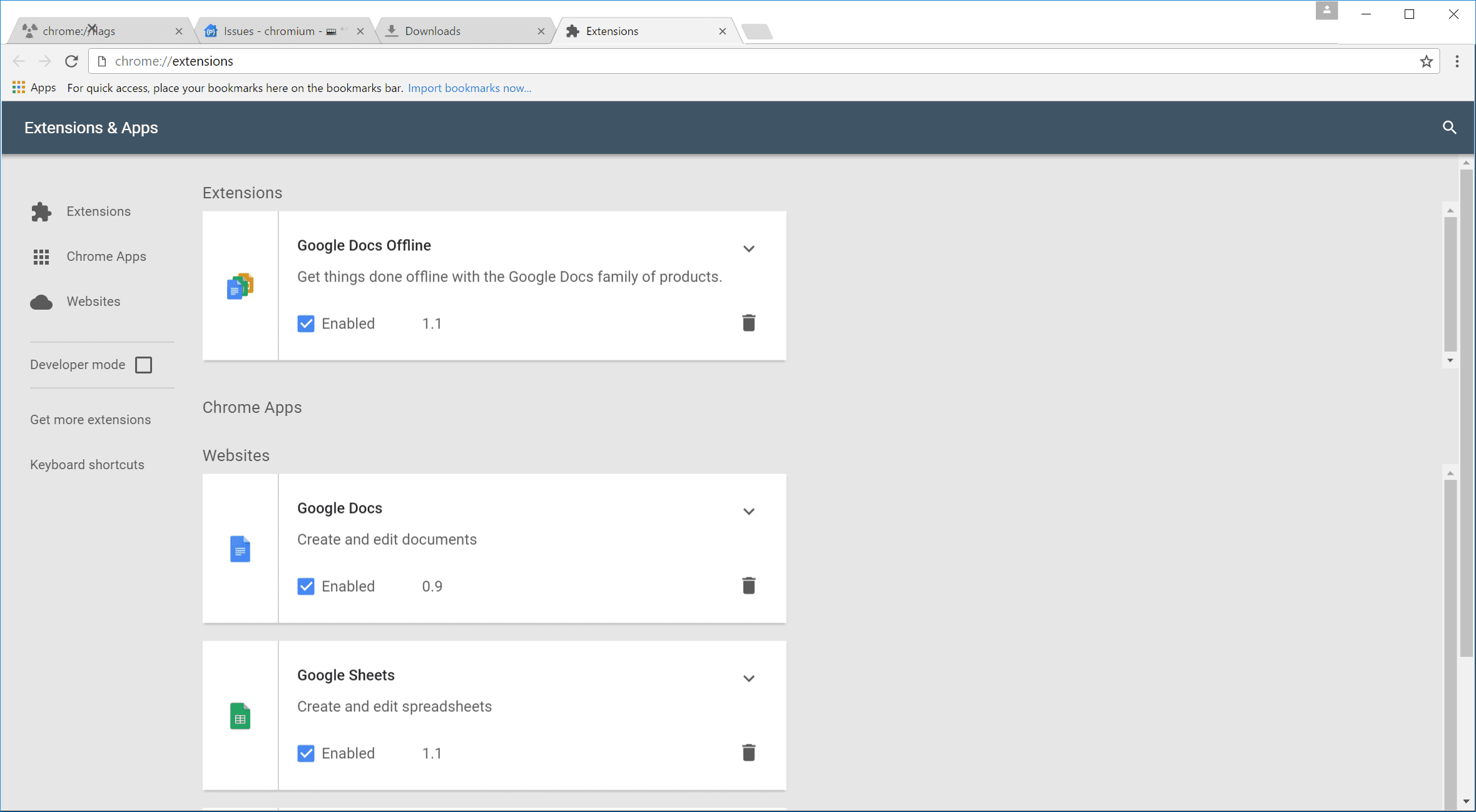
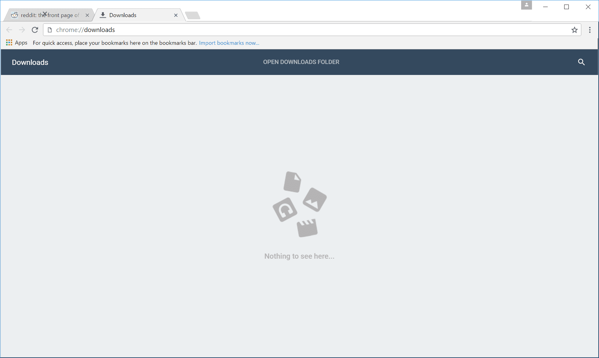
The Next Web managed to spot several new design tweaks that align Chrome with Material Design Principles. The changes in design, as can be seen below, are expected to be rolled out when version 50 of the browser starts seeding to users in an update.
The redesign affects the info bars, the security icon and the bookmark buttons as well as the edges of tabs which will now be squared instead of being rounded. The Chrome hamburger menu has been done away with in favour of three dots behind which users can access options like opening a new tab, going to the downloads page etc. Talking of the downloads page, it has been redesigned alongside others like settings, history and extensions. Scrolling bars in the browser are getting a facelift as are the icons. Chrome OS users also get an updated media player which is already live for everyone.
There is a step-by-step guide here in case you want to see some of the changes coming to Chrome right away.
Source: The Next Web
Lead image: Google


