


 More than three years ago, we were apprised of changes that would be imparted into Windows 10. One of the critical features of the update that was promised then was a radical shift in the manner apps and icons are designed. At that time, Microsoft had been pursuing the fluent design system under the Project NEON codename.
We have since seen notable developments in that regard thanks to iterative improvements from Metro design language during the Windows 8 days that was then updated to MS Design Language 2. The design’s approach has simpler and neat interfaces, but with character and flair that might be missing in the current Windows 10.
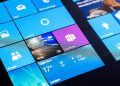
Now, part of this design is gaining momentum with a more widespread roll-out in the form of new and modern system icons. The new icons have already graced the computers of some Windows 10 users, and they are colourful and quite pretty, relatively speaking.
Not all users will see these changes because the roll-out is gradual, so it may take some weeks or months before these visual overhauls are seen.
It is also worth noting that previously, Microsoft had experimented with many icon designs, some of which were just too old for the current times. Nevertheless, MS says that fluent design simplifies their appearance, and I can attest that the current look will be appealing to many eyes, and matches the general vibe of Windows 10 five years after it was launched.
Design Leader at Windows and devices at Microsoft Christina Koehn says,” When icons in the taskbar and Start menu are different styles, it creates more cognitive load to scan and find applications. We needed to incorporate more visual cues into the icon design language using our modernized fluent design language.”
“Our experience ecosystems are incredibly intricate and have started to spill out of Windows into third-party platforms like Android, iOS, and Mac. We’re dedicated to making our icons familiar, beautiful, and inclusive within the modern phenomena of cross-platform, cross-device experiences,” adds Christina.
Speaking of third-party platforms, MS has since bunched its Office apps into a single app going by the same name for mobile operating systems. This a development that most of us were looking forward to because its fleet of office apps was taxing in terms of memory requirements.


