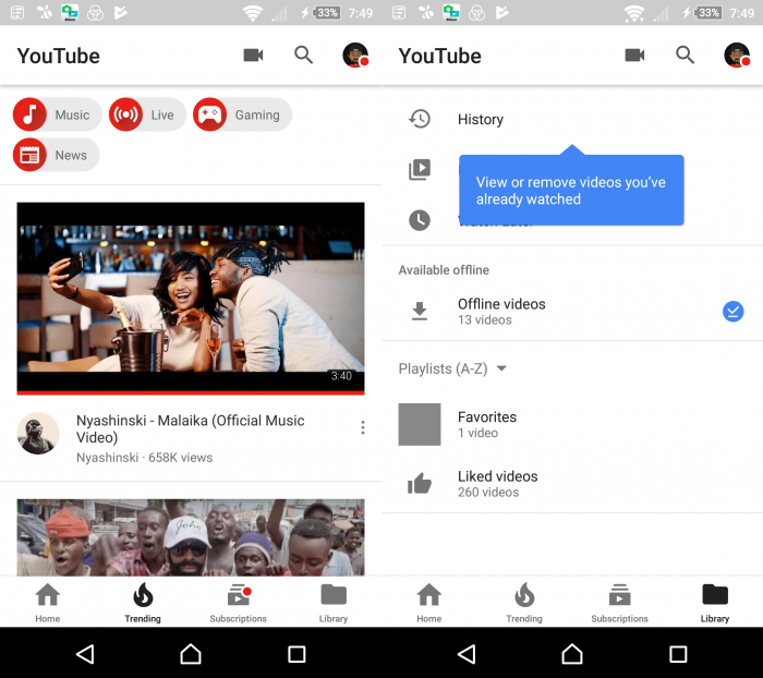
YouTube was rumoured to be testing a brand new white interface on their official app that would get rid of their characteristic “red accents” which we’ve grown accustomed to. Well, it has happened.
Yesterday, I got an interesting update. When I fired my YouTube app to watch my favourite channels’ recent uploads, I was greeted with a brand new interface which was rather odd at first glance.
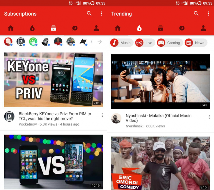
Compare it with the old user interface.
There are two major changes: The color and the menu bar placement.
YouTube got rid of the strong red theme at the top which enveloped the menu bar and the top status bar thanks to the material design update. They also got rid of the options
The tabbed menu bar has been brought down the bottom and they have changed how it looks. Previously, it used to be tabs with the corresponding icon depicting its use like a “house” icon for the general timeline, “fire” icon for the trending videos in your locale and the “play” icon for a feed of your subscriptions. Now we have a simplified bottom menu bar that has only four tabs: Home, Trending, Subscriptions and Library.
There are subtle changes to the user interface that you wouldn’t notice immediately. The “upload” button has been repositioned to the top right corner next to the search icon. The options button which had three dots at the far right was removed and in place, you have to tap on your YouTube avatar to access the various options it held under “Settings.”


