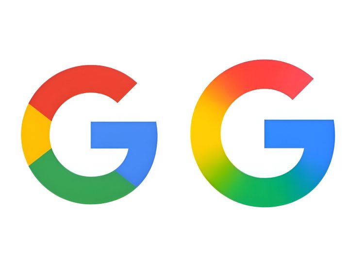
For the first time in nearly 10 years, Google has given its iconic “G” logo a subtle yet meaningful redesign.
The classic multicolored “G” that’s been a staple across Google services since 2015 is now being replaced with a sleeker gradient version, ushering in a new era that reflects the tech giant’s evolving identity in the age of AI.
While the shape of the logo remains unchanged, the most notable difference is in the color transition. The original version featured four solid segments: blue, red, yellow, and green.
The new design introduces a smooth gradient that flows through the same colors, giving the logo a more dynamic, modern, and fluid appearance.
This change may seem minor on the surface, but it signals a broader design shift within Google’s visual branding.
The updated “G” logo has begun appearing on the Google Search app for iOS and is being rolled out to Android devices through the beta release of Google app version 16.18.
Currently, the new icon is visible on iOS and Pixel devices, while the older version remains in use on other platforms, including the web and non-Pixel Android devices.
The new design is expected to roll out more widely across different devices and platforms in the coming weeks.
A Brief History
The last major change to Google’s logo occurred in September 2015, when the company adopted a sans-serif typeface and introduced the multicolored “G” icon.
Since then, the logo has remained largely unchanged, becoming a recognizable symbol across Google’s suite of products and services.
The new gradient design retains the familiar color palette but introduces a smoother transition between hues, offering a more contemporary look.
Public Reactions
As expected, the internet didn’t miss a beat when the change started surfacing. While many users appreciated the cleaner, more modern look, others joked that Google should focus on fixing bugs or making AI search more helpful rather than tweaking logos.
Aligning with AI and Modern Design Trends
This redesign aligns with Google’s evolving focus on AI and its associated branding, such as the Gemini logo, which also features gradient elements.
The updated “G” icon reflects the company’s commitment to innovation and modern design aesthetics, indicating a broader visual shift within Google’s design strategy.


