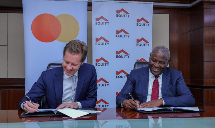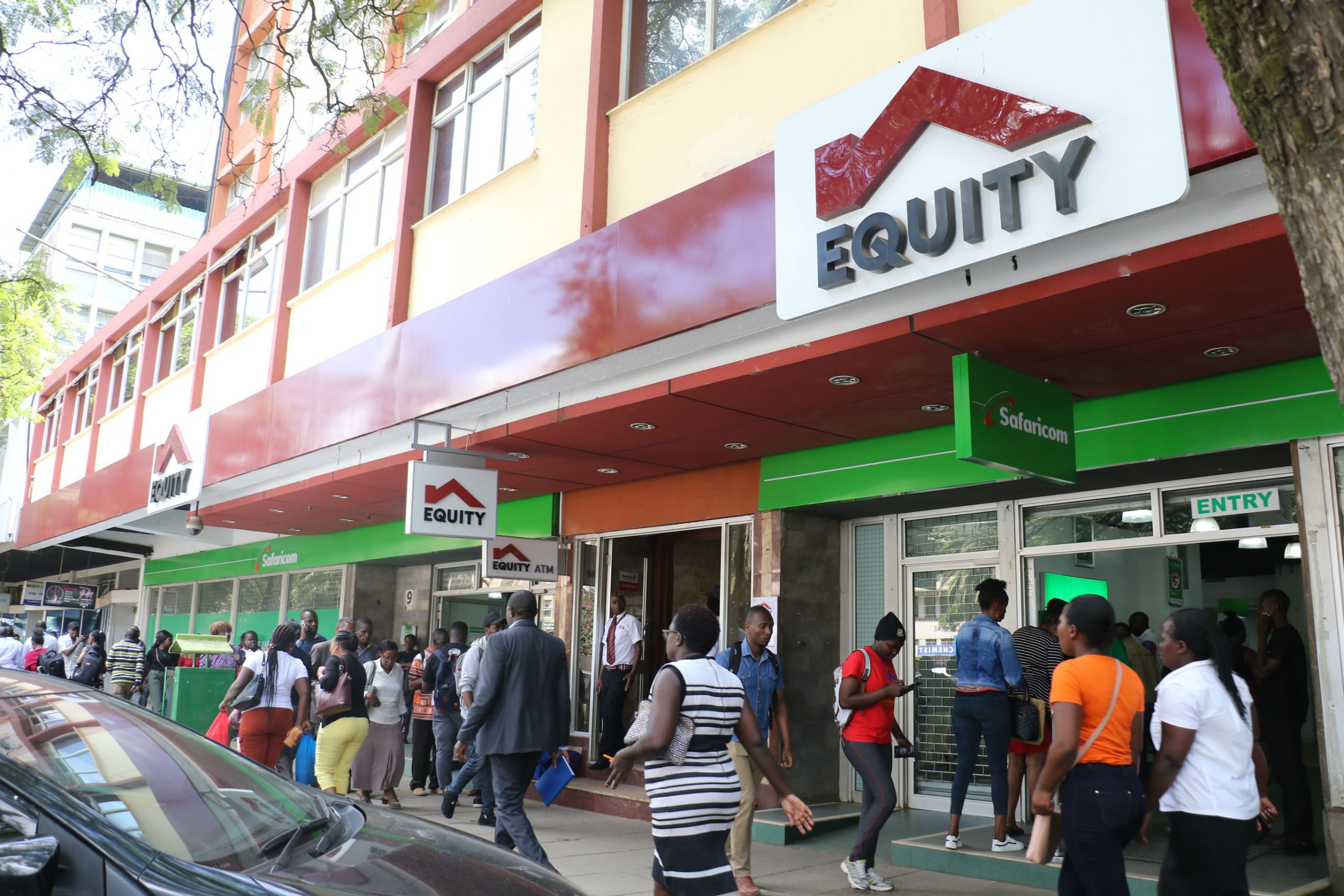
Yesterday, Equity Group celebrated their 35 years of existence in the Kenyan market. Equity Group is a huge brand in the Kenyan market that started with the popular Equity bank. The company has grown to include entities like Finserve which is a mobile virtual network operator (MVNO) that trades under the name Equitel in Kenya.
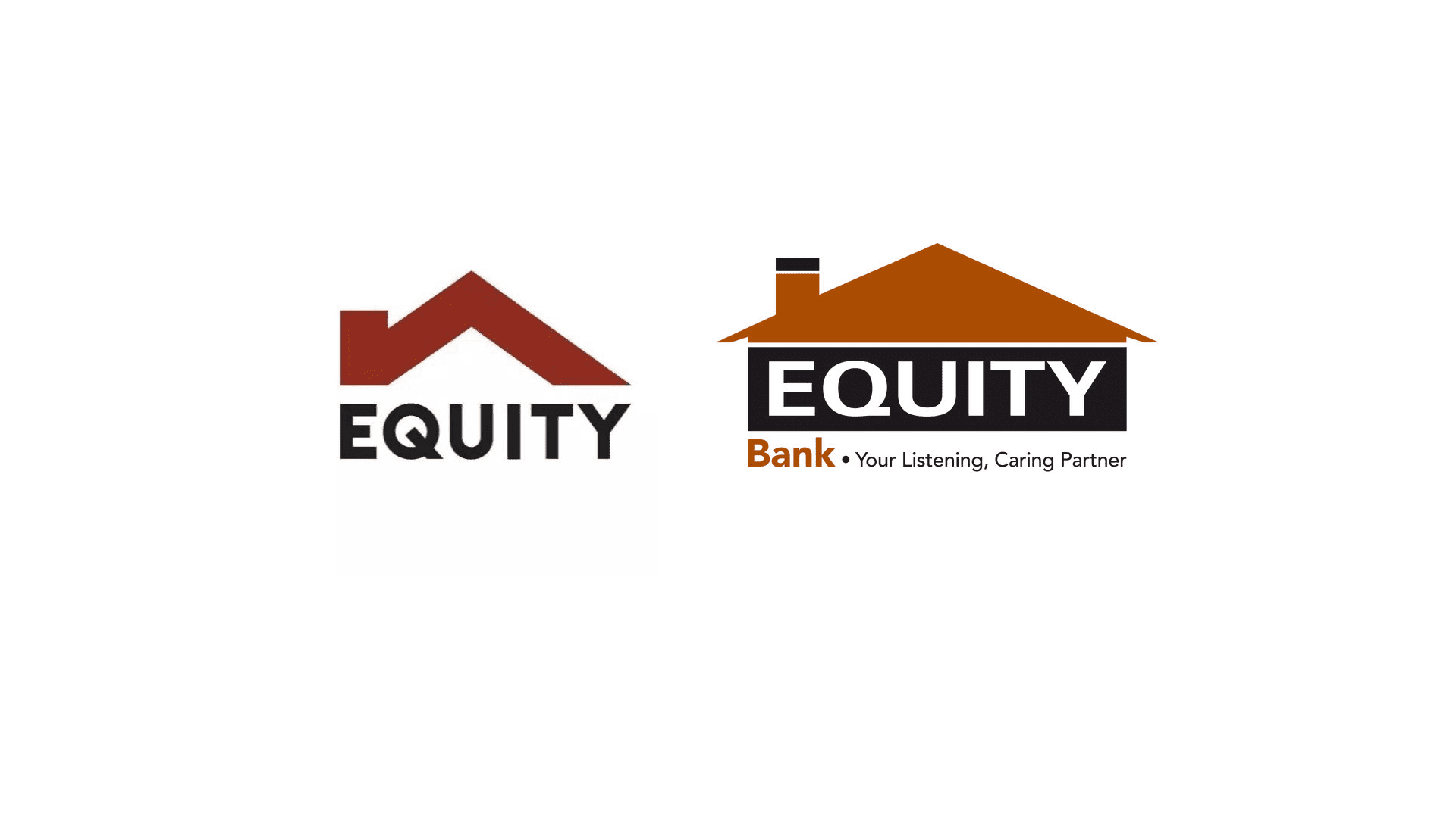
The celebration that was held also led to the company launching a new logo. It is not uncommon to see companies rebrand their logos after a while and of course it usually leads to people having mixed feelings about it.
The old Equity logo looked like a house with a chimney and the word “Equity” written underneath. The new logo got rid of that and opted for a simpler roof silhouette of the old logo.
People love consistency and for some, this can be jarring to them. However, some can embrace a logo change and this was shown well on social media.
This sums up the logo quite well
#ANewLookEquity The new logo now features “Equity” without an entity name such as Group, Bank,Insurance, or Investment Bank. pic.twitter.com/NIctH2EFt4
— RICHARD STORNCHATT (@RICHIESTORN) October 2, 2019
Old was much better
Old Equity bank logo design was way much better than the new logo design ~ my opinion
— Frank_KanaTech🇰🇪 🇵🇸 (@Frank_KanaTech) October 3, 2019
Finds it flat
I'm I the only one who is finding this new Equity Bank logo flat?
— Jeff Kinyanjui (@_JeffKinyanjui) October 3, 2019
Was it made on Microsoft Paint?
https://twitter.com/ThaShiznitt/status/1179508218588024832
This guy thinks it is cringy
This new equity logo is cringy pic.twitter.com/TP8YbYTz0J
— DSN-W (@Czaer_) October 2, 2019
It looks like a “mountain”
Hiyo logo ya equity ni mtkenya ama?? It looks like some mountain https://t.co/pNQ7TfL7gK
— Elvis presley (@Elvispr65) October 3, 2019
However this person thinks it is not that bad
Equity Bank’s new logo isn’t that bad as people are claiming. It wouldn’t win any award either.
— Kenyan (@KenyanHustler) October 2, 2019
It is way funnier on Facebook
Some comments from my Facebook page about the new Equity Bank logo pic.twitter.com/B6evCE50IX
— Kanali (@NicKanali) October 2, 2019
Okay this is funny
Equity's new logo is what the rock used to do with his eyebrow
— Al (@Alngumo) October 3, 2019
She doesn’t like the Q
i like the new Equity Logo, not a fan of the "Q" though
— terrierist (@youloveleona) October 3, 2019


