


Facebook has yet again made another visual change on their flagship social network, which has actually been available to Beta users for quite some time now.
The new user interface has a lot of changes here and there which Facebook was kind to reveal in a post.
Improved Readability
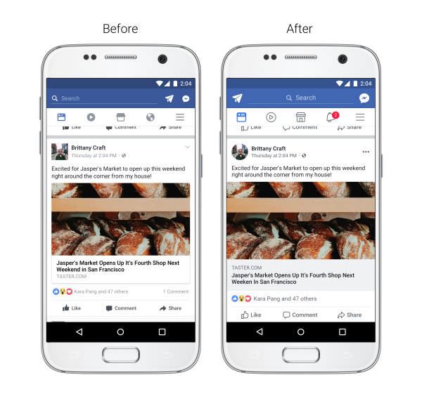
Facebook has increased the colour contrast for typography to be more legible, larger link previews, updated icons for Like, Comment and Share and circular profile pictures like Twitter.
Easier Navigation
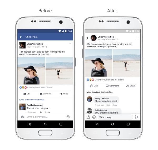
Facebook has now changed how we navigate the NewsFeed where it is not easier to see where the link will take you when you click on it and see whose post you’re commenting/reacting/reading while on the post. You can return to the Newsfeed once you’re finished reading using a redesigned back button that is located in the top left.
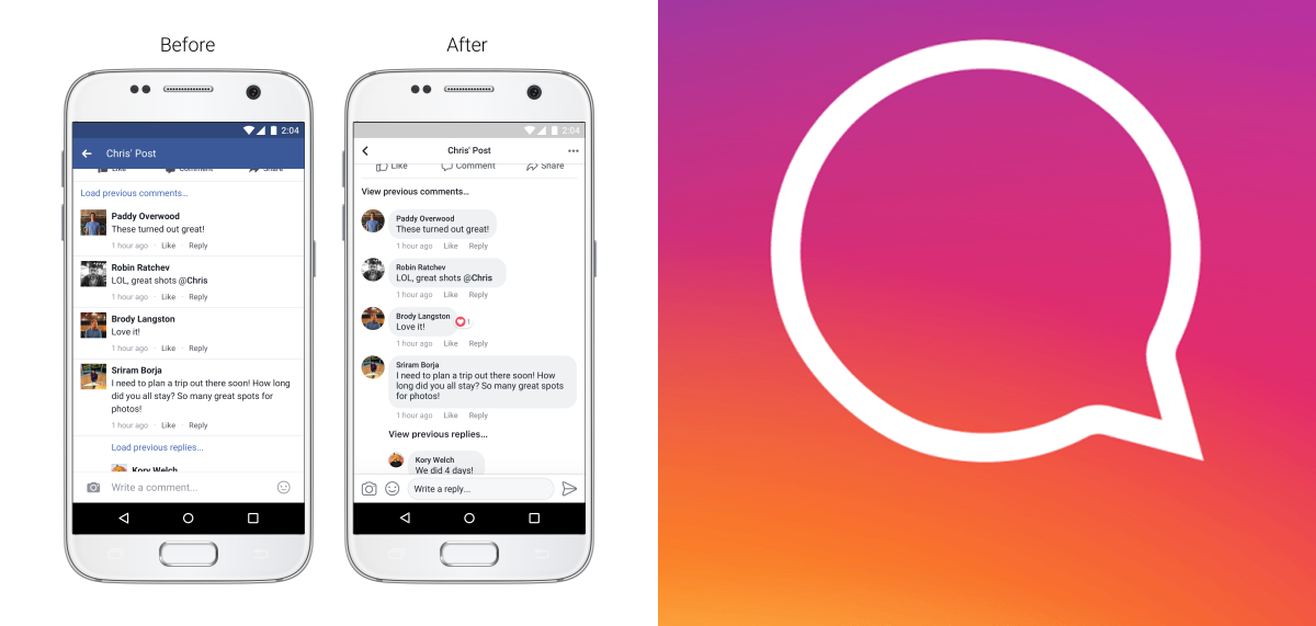
Better Conversations
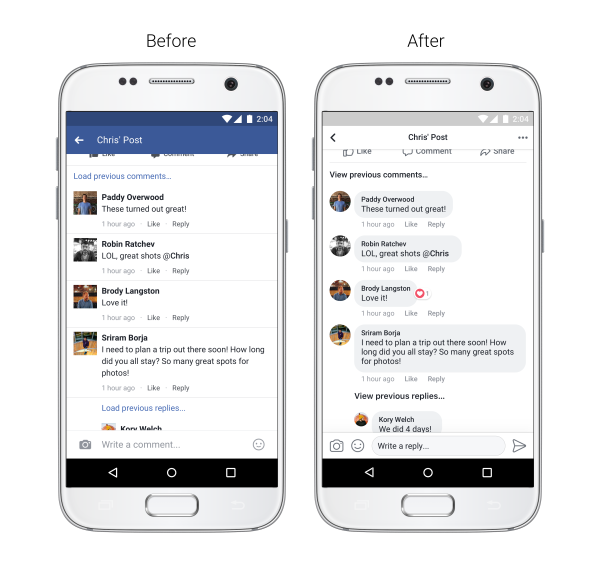
Facebook has updated how we comment on the platform where you get to see comments enveloped by a grey round rectangle which they say will make it easier to see which comments are direct replies.
Facebook’s subsidiary, Instagram announced comment threads and it seems like the system we have seen on Facebook.
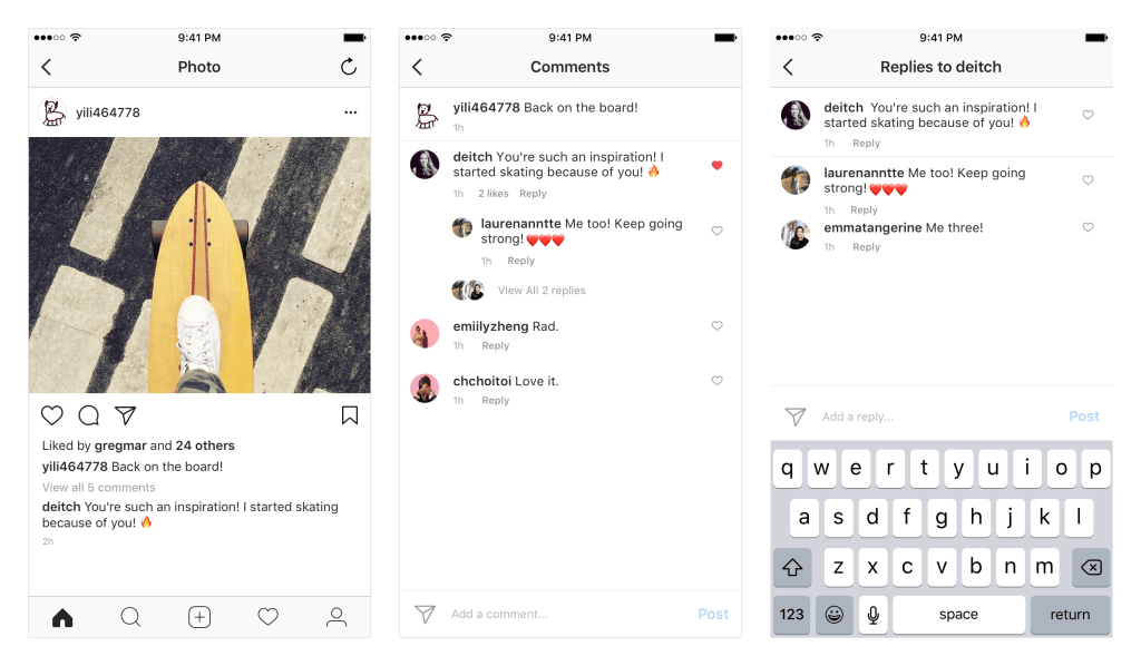
In this new update, when you reply to a comment on Instagram, your response will be grouped underneath it in a thread, which would make it easier to follow them. Previously, following these comments were a mess and it is great that they have fixed this issue. This update is currently being rolled out on version 24 of the Instagram app for iOS and Google Play.


