


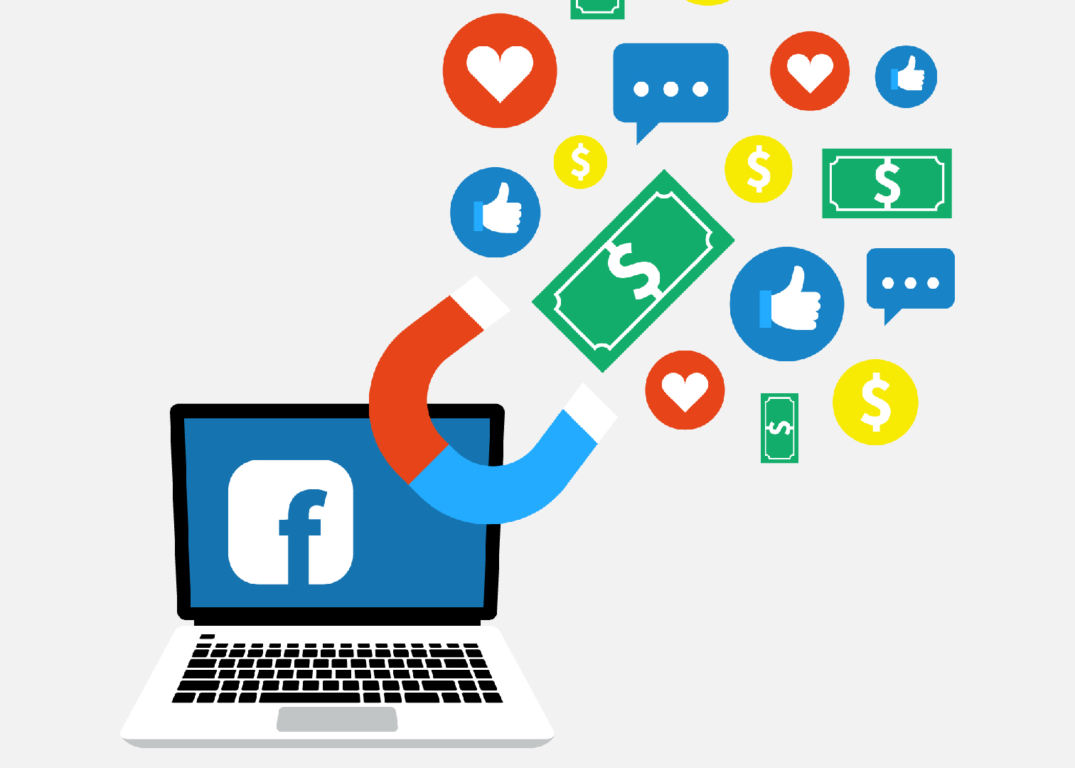
Facebook now has a new flat logo to separate itself from its products. The new Facebook logo distinguishes the Facebook company from the Facebook app. The new Facebook logo has a different font than the one they use for their apps. There’s a GIF that rotates between their various brand assets colour schemes – Blue is for Facebook, green is for WhatsApp, pink-orange is for Instagram.
![]()
People on Twitter expressed their opinions about the new Facebook logo and we’re here for it.
Twitter reacting to the new Facebook logo pic.twitter.com/cZzPYgHgLa
— patrick. (@imPatrickT) November 4, 2019
Props to Facebook on finally embracing their only remaining users and switching to enlarged boomer phone font https://t.co/98WM4WB1pI
— Jess Dweck (@TheDweck) November 4, 2019
So it changes colour near your sweatiest body parts…? https://t.co/XxknY4tUcB
— Olivia Solon (@oliviasolon) November 4, 2019
The problem is forcing "from Facebook" on Insta & WhatsApp could signal waning autonomy and scare away talent https://t.co/tj5UYCEIOx pic.twitter.com/26WI3qKzFx
— Josh Constine 📶🔥 (@JoshConstine) November 4, 2019
https://twitter.com/jamestitcomb/status/1191390428001521664
https://twitter.com/jamestitcomb/status/1191390428001521664
I’m reading it as
“*normal voice* Facebook changes its brand to *screaming* FACEBOOK”And considering how horny Zuckerberg is for attention, it makes sense
— shana (@hashtagshana) November 4, 2019
Why is FACEBOOK yelling at us? We should be yelling at FACEBOOK…for trading our privacy, failing to better protect truth & for refusing more accountability. https://t.co/x9QxAwbBWV
— Maya Wiley (@mayawiley) November 4, 2019
https://twitter.com/nationalparke/status/1191415695864684547
glad Facebook has embraced its true brand ALLCAPS YELLING https://t.co/LRQNv2ypzu
— Alexandra Petri (@petridishes) November 4, 2019
Moving to all caps is on brand, considering FACEBOOK is now mostly about shouting online at people you used to know as human beings. https://t.co/qHMQjO0uQn
— Matt Stoller (@matthewstoller) November 4, 2019
Soooo Facebook changed their logo in hopes of establishing more positive brand sentiment by reminding users that they also own platforms like Instagram and WhatsApp…
Yeahhhh…okay. 🙄🙄
— Nani (@_illuminani) November 4, 2019
The new Facebook brand feels more futuristic and less rustic than the last
I don't know about you but it also gives a bit of dystopian vibe… I made a movie poster to express the vibe pic.twitter.com/sT3rBMncKH
— Jane Manchun Wong (@wongmjane) November 4, 2019
is it just me or is the new facebook logo terrifying https://t.co/PZamJe86sh
— Terron Moore (@Terr) November 4, 2019
This looks like the most unfriendly corporate logo ever and I trust Facebonk approximately 69% less https://t.co/0Q4NmAdbWw
— Canoopsy (@Canoopsy) November 4, 2019
Literally no one cares, ever, about logo changes outside the company. Reporters (used to be one) roundly hate having to write logo change stories. I wouldn't be surprised if they're the leading cause of ennui in the profession.
It's so deeply dumb. Even inside companies…. https://t.co/vOCvjlm2qn
— Chris DiBona (@cdibona) November 4, 2019
https://twitter.com/tilehopper/status/1191396992435359745
https://twitter.com/jank0/status/1191389455879262208
https://twitter.com/chriswelch/status/1191390656847106054
https://twitter.com/parismartineau/status/1191389840534917120
https://twitter.com/yoda/status/1191390198019624960
Facebook:
-racism
-conspiracy theories
-unethical business practicesFACEBOOK:
-RACISM
-CONSPIRACY THEORIES
-UNETHICAL BUSINESS PRACTICES— Sam Sykes (@SamSykesSwears) November 4, 2019
I fixed Facebook's new logo to better fit their brand identity. pic.twitter.com/2VKK2TtFBE
— M. Brandon Lee | THIS IS TECH TODAY (@thisistechtoday) November 4, 2019
So now WE START SHOUTING AT FACEBOOK and other brands who are 'all capitals' important .. https://t.co/9tLis3j13w
— ♦️Eileen Brown BSc (Hons.) Digital Advisor (@eileenb) November 4, 2019
It’s FACEBOOK, OK??? https://t.co/P7nG1kbzPR
— Donie O'Sullivan (@donie) November 4, 2019
https://twitter.com/LanceyAceGG/status/1191432373243711489
THEN: Google → Alphabet
NOW: facebook → FACEBOOK(Today's word: "upbranding") https://t.co/Xh76A7zG96
— Kontra (@counternotions) November 4, 2019
https://twitter.com/mdrndad/status/1191390438420299776
Whenever I see an Indiegogo campaign for, say, a ballpoint pen that can also charge your MacBook Pro simply by converting the free radicals in your perspiration to electricity, they have a logo that looks pretty much like this one. https://t.co/zuXQvLADpS
— Andy Ihnatko (@Ihnatko) November 4, 2019
https://twitter.com/reneritchie/status/1191388925639692288
look at that subtle off-white coloring. the tasteful thickness of it. oh, my god. it even has a watermark. https://t.co/KEXFLVXL8O
— Seth Trueger (@MDaware) November 4, 2019
https://twitter.com/backlon/status/1191389948345061381
https://twitter.com/margarita/status/1191403677858201604
Facebook’s new brand tl:dr: All that shit you use is from Facebook, and don’t you forget it (also, please don’t break us up?) pic.twitter.com/LuXx3Dt8Jl
— Alex Kantrowitz (@Kantrowitz) November 4, 2019
Finally, writing in caps-only about how Facebook is dismantling democracy won't look like I'm yelling, I'm just sticking to their brand. https://t.co/pJUQzsVJI7
— Rami Ismail / رامي (@tha_rami) November 4, 2019
whats even the point of logo design anymore? theres a mountain of Identity elements underneath this of course, but is this Bland-Sans really where everyone starts with now? it just screams “out of ideas and soulless”
actually, that might be perfect for fb https://t.co/yhKNbOJ4PG
— Brandon Moore ™️ (@BMooreCreativ) November 4, 2019
This fits nicely with my policy of ignoring anything in all caps. https://t.co/ZAHc6W0kq9
— Spencer Jakab (@Spencerjakab) November 5, 2019
https://twitter.com/backlon/status/1191395368665108480
In other news, facebook rebrands as FACEBOOK, because the real problem with the company was the lack of all-caps in the name, not the democracy-eroding facist-adjacent surveillance capitalism. https://t.co/biAOPQQQKS
— Morten Rand-Hendriksen is elsewhere (@mor10) November 4, 2019
Honestly surprised they didn’t do a de-facto full re-brand with a holding company. Given everything stated, it would seem to make more sense. Not to mention the um, trouble the brand has seen in the past couple of years? Keep FB as the social network, a subsidiary of ________.
— M.G. Siegler (@mgsiegler) November 4, 2019
https://twitter.com/caseynewton/status/1191387264447705089
Aha! The reason! They didn’t want to do it from a position of weakness. Which is admirable in a way, I guess. But still would have made more sense when you just take a step back. Not sure that’s really a good reason not to do something… https://t.co/26dCyC7oF9
— M.G. Siegler (@mgsiegler) November 4, 2019
https://twitter.com/cap/status/1191399600969670661
https://twitter.com/caseynewton/status/1191389629812854784
https://twitter.com/danielwcooper/status/1191390811117752322
today in anti-antitrust messaginghttps://t.co/y6wx6YLF8M
— rat king 🐀 (@MikeIsaac) November 4, 2019
https://twitter.com/reckless/status/1191391468042235904
*whispers* I’m a fan of expanding beyond the blue https://t.co/JQPUjtZLnj
— Kerry Flynn 🐶 (@kerrymflynn) November 4, 2019
The new Facebook brand is really something…
They went full Dropbox. You never go full Dropbox.https://t.co/X8cSEHuVq6
— Andrew Wilkinson (@awilkinson) November 4, 2019
Thus ends my corporate branding TED talk. ✌️
— M.G. Siegler (@mgsiegler) November 4, 2019


