


 YouTube can be a very good source of endless entertainment where you can spend up to 30 hours on it according to some people. Just see the replies to this tweet. Its autoplay feature keeps you watching related videos and YouTube is now changing the layout of the “Up Next” screen to give it a simple design.
Here’s the new “Up Next” Screen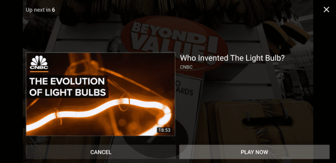
Compare it to the old “Up Next” screen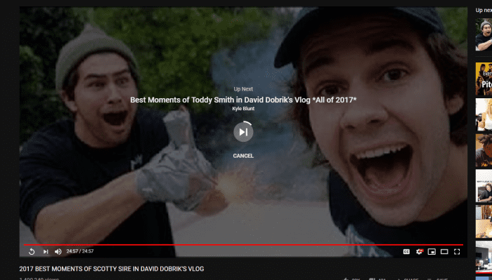
The new design shows how the next video overlayed over the last playing video. The countdown is shown on the upper right corner. The Play Now and Cancel buttons are displayed below the upcoming video.
According to Android Police, the rollout is server-side to the Android app. In my opinion, I prefer the old minimal layout as the new layout has a lot of empty space just like the new Twitter design.
The new update joins “Topic Filters”, another change YouTube rolled out last month.


