


Facebook started rolling out their much awaited web design refresh yesterday globally after months of waiting.
This redesign was announced during their annual F8 conference last year and they promised that it will be faster and more immersive.
Well, I got the notification yesterday to try it out and it has been a breath of fresh air for the 15-year-old social network.
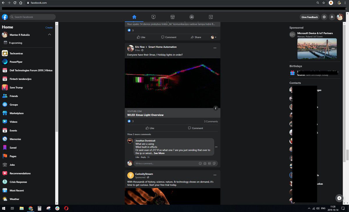
The first thing you notice is how clean it is. It sports flatter modern icons with a look that we have seen with the refreshed Facebook design on mobile.
At the top, we have the search button adjacent to the Facebook icon. We also have the News Feed, Facebook Watch, Groups and Gaming Tabs. At the far right, we have the create tab that allows you to create a Page, an Ad, a Group, an Event or a Marketplace listing. The rest of the tabs include the usual Messenger tab, notifications tab and the account tab to see your profile and settings.
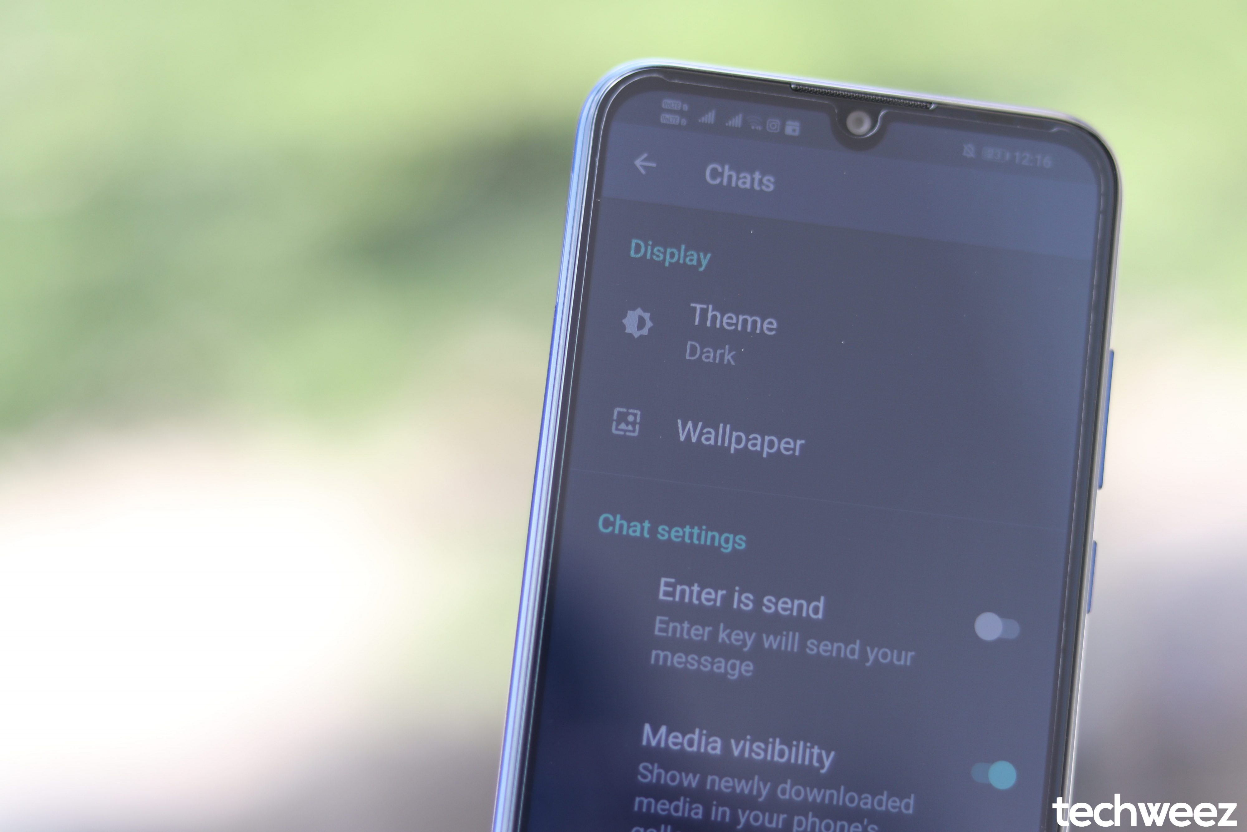
Another important update is that Facebook for Web finally received the dark mode treatment. There is a dark mode toggle on the account option at the top and it is a welcome move for those of us who use Facebook for Web in the dark. On mobile, Facebook has only implemented dark mode on Facebook Lite, which is their smaller, more data-efficient version that they built on top of Snaptu.
Facebook terms this redesigned user interface as beta which means it might have some niggles here and there when you use it. It is worth checking it out and enabling it and finally Facebook feels like it is in 2020 and not in 2005 like the previous retro design.


